There is a lot of buzz right now about responsive web design, lots of designers, developers, UX experts and marketing people are talking about it and several major companies have already migrated their web sites from two specific versions for mobile and desktop to a single responsive design.
Something really surprising is that emails have been ignored when talking about responsive design, and everybody seems to assume (wrongly) that responsive design only affects to web pages.
In fact, emails have been hated by web developers and designers for years... nowadays, nobody likes to go back
to the 90's and create table-based layouts with inline CSS and not being able to use most of the CSS properties
(even basic stuff like the float property is not safe to use on emails)...
But this is not an excuse to ignore the email: lots of companies rely more on their email campaigns than on their website so they can't just ignore their increasing mobile users.
Why responsive?
First of all, because there is no alternative: in opposition to web sites, on email if you want to target your mobile users the only way to do it is by using a responsive design (well, you could ask them what kind of email they want to receive, but this isn't useful on most cases when users check their emails from several devices).
Secondly, because we can. Thanks to the smartphones and the email clients they feature (which are almost the same as their web browsers), we are able to add tons of CSS3 magic to our emails (and this includes media queries!).
Design principles
It's important to notice that we have to keep supporting old email clients and webmail clients... So I'm sorry, but we won't be able to get rid of the table layout... this means that the email structure will be almost the same as regular emails.
My main advice on email designs is to keep them simple: for example try not to emulate background images by creating huge tables with tons of cells with images inside.
Instead of this, a simple layout should do the work. If you want to add any elaborated element or effect, just use CSS/CSS3 providing a fallback for old Email clients (as you would do in regular web development). This technique is useful for border radius and background images.
Also, another tip for making your life easier is to use single column layouts: it will be much easier to make them responsive.

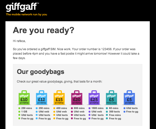
The previous example corresponds to one the giffgaff campaign emails designed by @bipolarArtist. The design is really simple and clean, which makes it easy to implement as a responsive design.
Even though, it has two subtle effects that have been implemented using CSS rules not recommended for emails:
<table class="box" width="580" cellpadding="0" cellspacing="0" border="0" style="border-radius: 7px;">
  <tr>
    <td class="boxcell" width="580" style="background-image: url(black-triangle.png);">
Rules like border-radius and background-image won't be supported by all the email clients, but this is not a big deal as
long as the email still looks well on those clients:
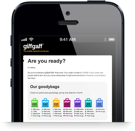
Making it responsive
When an email is opened from a mobile device (like an iOS or Android device), the email client rescales the email viewpoint to make it fit horizontally on its screen. This makes the text, images and all the details almost unreadable. And even though most clients keep a minimum font size for texts when zooming out, this size is not big enough to be confortable to be read:
Adjusting the email container width
The first thing to do to make it look better is to change the main container width to fit the mobile screen size, so this way the mail client won't need to rescale it. To do so, we can use CSS media queries (notice that smartphone email clients, as opposite to webmail clients, are able to read CSS properties not defined inline):
<style>
@media only screen and (max-width: 480px) {
  /** your mobile styles go here **/
}
</style>
Now, inside the media query, we should redefine every table width to match the mobile horizontal size. If desktop emails use 600px as a standard width, 320px is a good size to choose for the mobile version.
@media only screen and (max-width: 480px) {
  table[class="box"], td[class="box"] {
    width: 300px !important;
  }
}
(Note that attribute selectors are being used to prevent Yahoo! Mail from displaying the mobile version).
All the tables in the email should be modified in the media query (to make them smaller), so this is why I recommend keeping the layouts simple and use as less tables as possible.
Adjusting other stuff
Just changing the table widths won't be enough in most situations: if the email contains big images they'll prevent the tables to become thinner... so we'll have to reduce the image sizes as well.
The most efficient way to do so is by setting a max-width for all the images:
@media only screen and (max-width: 480px) {
  table[class="container"] img {
    max-width: 100% !important;
  }
}
Also, we can change font sizes, margins, and even hide elements... whatever is needed to make the email look good on smaller screens.
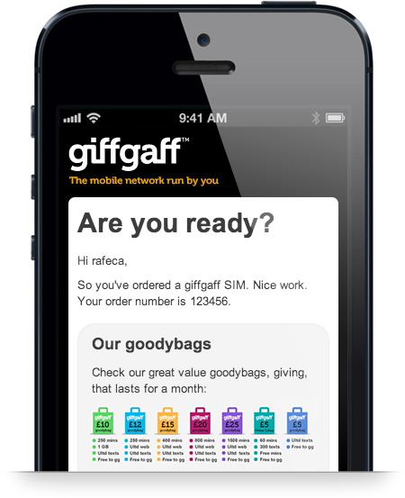
With a few adjustments we'll get an email with nice big fonts which is easy to read in mobile devices:
Using mobile specific images
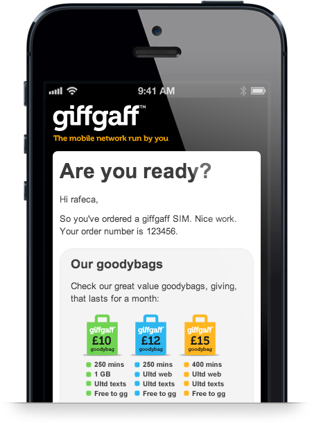
As you may have noticed in the previous screenshot, reducing image dimensions to fit them in the screen may lead to too small images that don't look well.
To fix this, we can replace the big images by their mobile optimized versions. This can be done inside the media query, but we must create a rule for each image.
First of all, we should put the image element inside a parent element that can be uniquely identified on the CSS:
<div id="info-goodybags"><img src="gfx/info-goodybags.png"/></div>Now, we should hide the image tag and apply a background image to the container element inside the media query:
@media only screen and (max-width: 480px) {
  div[id="info-goodybags"] img {
    display: none !important;
  }

  div[id="info-goodybags"] {
    background: transparent url(gfx/info-goodybags-mobile.png) no-repeat;
    width: 210px;
    height: 139px;
  }
}
With this, we can use a smaller image for mobile that won't be scaled down on mobile devices and therefore it will look much better:
Main problem here is that there is no automatic way to replace all the images by its mobile version without having to do it one by one (and setting in the CSS the image width and height), so this becomes a time consuming job in emails with lots of images.
Using high resolution images
Emails can also contain images optimized for high pixel density screens (like the retina displays). Again, it's easy to replace a single image by its high-resolution alternative, but it becomes a crafting job to do this for lots of images.
Using media queries we can target mobile devices with high-resolution displays and make them render the optimized images:
@media only screen and (max-width: 480px) {
  div[id="info-goodybags"] img {
    display: none !important;
  }

  /* Image for mobile */
  div[id="info-goodybags"] {
    background: transparent url(gfx/info-goodybags-mobile.png) no-repeat;
    width: 210px;
    height: 139px;
  }

  /* HiDpi image for mobile */
  @media (min-device-pixel-ratio: 2.0) {
    background: transparent url(gfx/info-goodybags-mobile@2x.png) no-repeat;
    background-size: 210px 139px;
  }
}
Note: We can also provide high resolution images for the desktop version of the image, but this would mean creating yet another CSS rule and another version of each image and another and in this case it wouldn't be available to most email clients (remember that webmail clients like Gmail doesn't support CSS selectors).
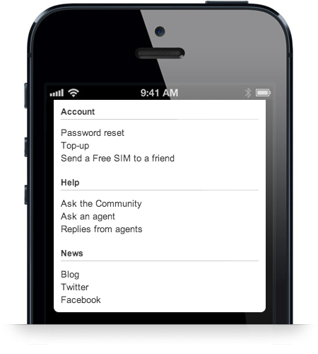
Working with multiple columns
As I said at the beginning of the post, I don't recommend having multiple columns in responsive emails: it adds even more complexity to the layouts and in most cases single-column emails are simpler and cleaner.
Even though, in some situations it's nice to have several columns in the desktop version, which may be displayed as a single column in the mobile version:
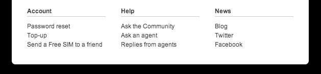
To do so, we should have an html like:
<table class="linkstable" width="540" cellpadding="0" cellspacing="0" border="0">
  <tr>
    <td class="linkscell">
      <table width="180" cellpadding="0" cellspacing="0" border="0">
        <tr>
          <td>
            <!-- content of first column -->
          </td>
        </tr>
      </table>
    </td>
    <td class="linkscell">
      <!-- (...) -->
      <!-- second column -->
As you can see a nested table inside each column is needed, which makes HTML more verbose and complicated.
Now, to display these columns as a single column in the mobile version, we have to redefine the style again using media queries:
@media only screen and (max-width: 480px) {
  table[class="linkstable"] {
    width: 260px !important;
  }

  table[class="linkstable"] .linkscell {
    display: block;
  }

  table[class="linkstable"] .linkscell table {
    width: 260px !important;
    margin-top: 15px;
  }
}
The important rule here is the display: block. It will make the table cells behave like regular block elements and then they
will be moved one at the bottom of the other:
Conclusion
If your company uses email as an important marketing resource and you are not sending responsive emails yet, you are loosing money. There is no technical or business reason to not switch to responsive emails. So if you have the needed resources, redesign your emails and create a responsive version and your conversion rates on mobile will be improved immediately.
Update
I have opensourced this whole responsive email as a template, to serve as inspiration to future readers. You can find the code in GitHub.
« Home